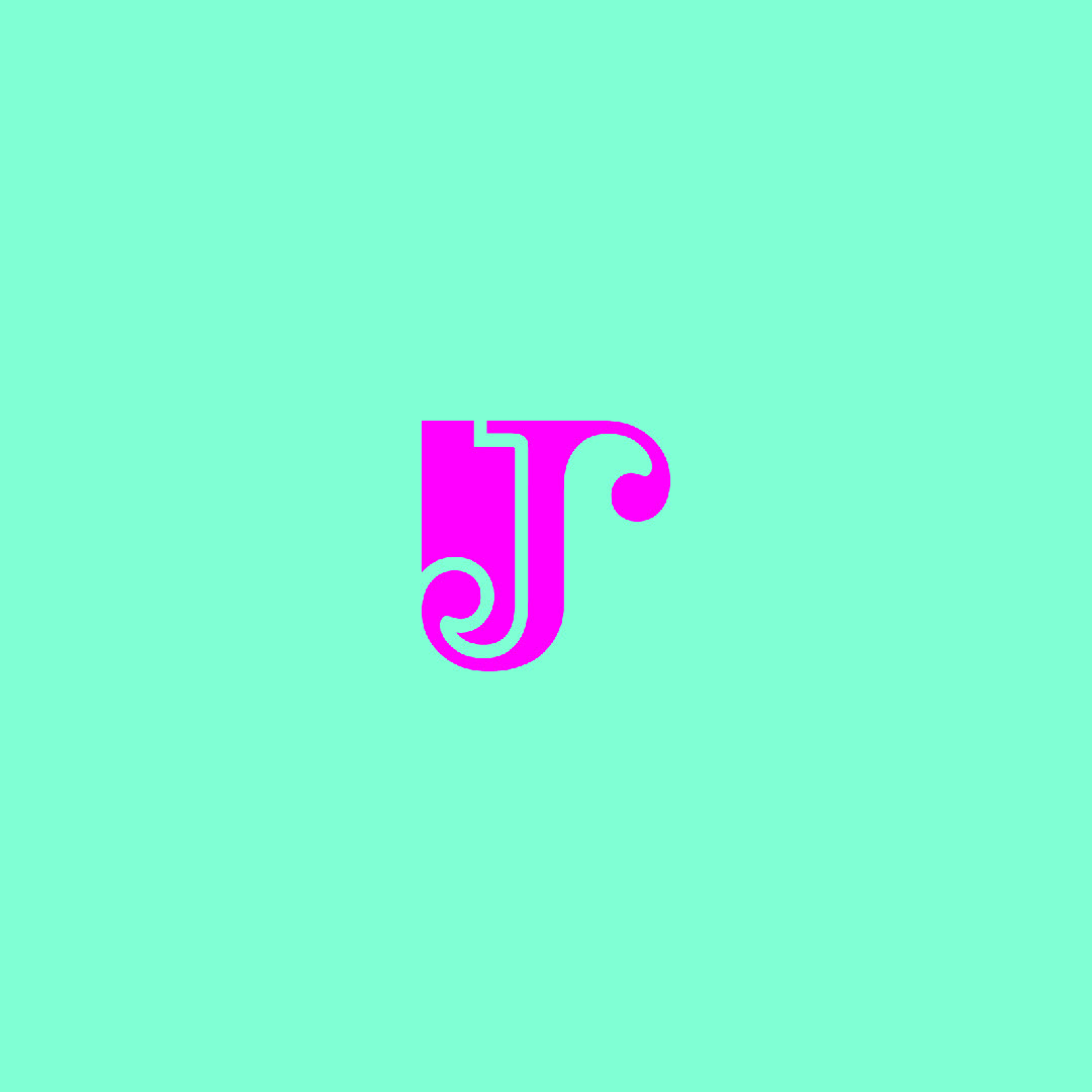
THE LX ALPHABET
Here's a bit of an explanation...
I took on a challenge to design a logomark for every letter of the alphabet (A-Z). Sharing them on my social media platforms day by day for 26 days in a row, until all designs were released. The results are below...


WHAT DOES A LOGO LIKE THIS LOOK LIKE IN A BRAND IDENTITY?
Let's have a look...
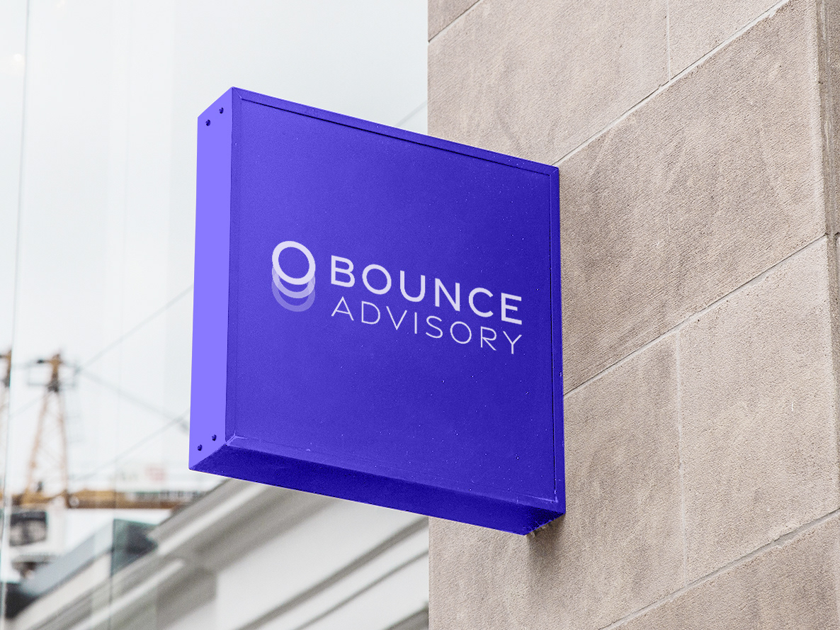
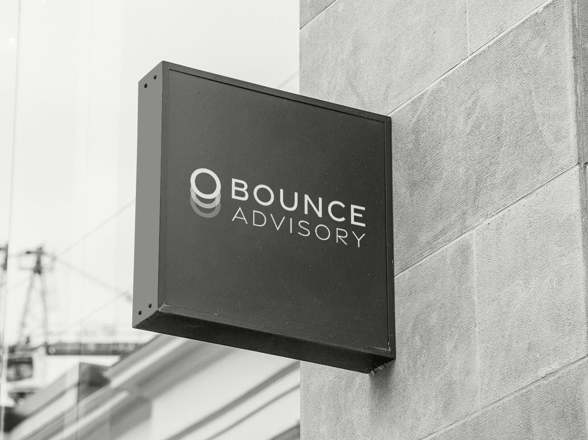
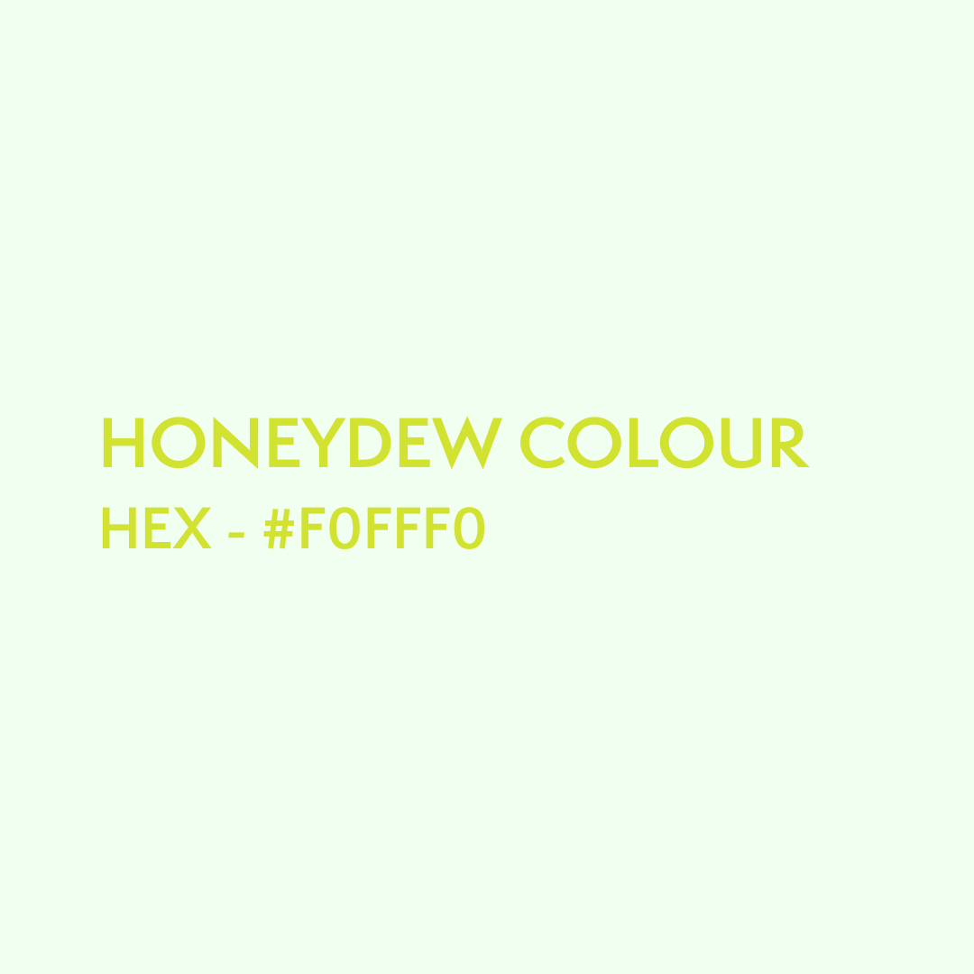
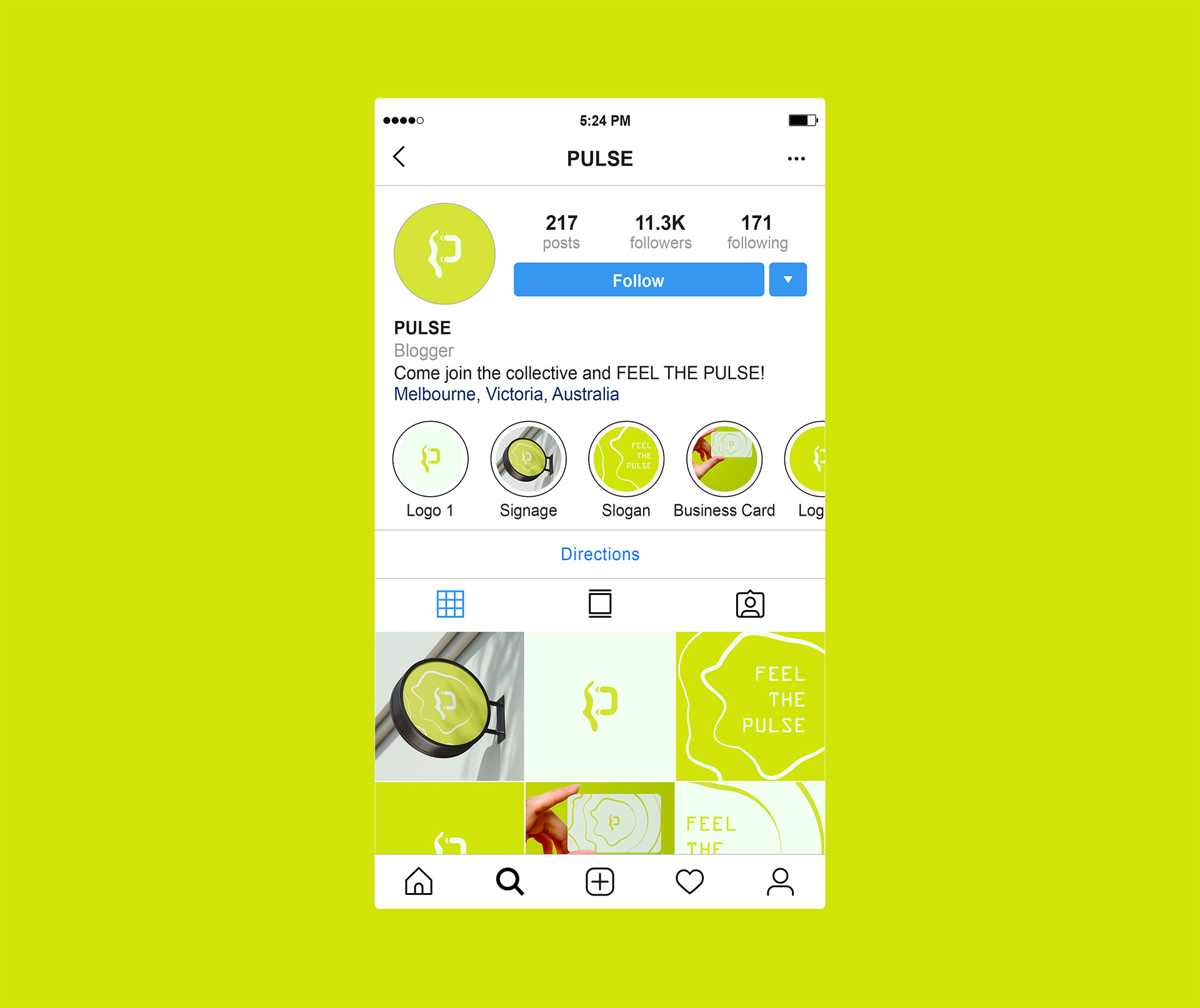
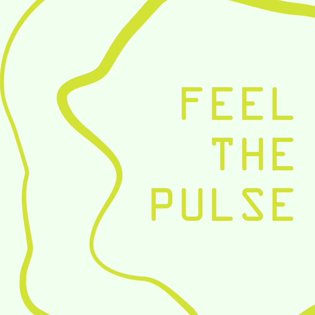
I've chosen the letter P to depict what one of these logos would look like in a brand identity. The logomark has a fluid look. A part almost appears as if a pulse of energy is emitting from one part. To continue that aesthetic, I created another brand asset, a brand pattern. That's what the wavy lines that accompany the logomark on the signage, business card, and Instagram profile are. What this does is help emphasise the tone you want to convey. It's also a pattern that clients will associate with the brand, making your brand more recognisable and memorable, overall improving the business's marketability. It's also important to keep your brand identity visually consistent across all platforms and mediums. Which is why using a colour palette is essential. A colour palette can range from 3-8 colours. For this example, I've just got 2. Pear and Honeydew. If there were a brief for this brand, the colours would be carefully selected to reflect the client's wants and the business's needs, as outlined in the brief. As you can see in the example below, I've successfully created a consistent and harmonious visual experience, boosting the brand's memorability and visual appeal.


WANT A BRAND IDENTITY LIKE THIS?
Well, you can!