The brief
The task for the Frontier Possible logo design update was to communicate the changes in which the owner's business operates. Previously, the service was computer training, but in 2023 the owner expanded their role as someone who used technology to help their clients with their life/business. This included technology training, digital products and support. The owner had a clear vision of the colour palette's direction, wanting red, blue, black and white. This slightly steered away from the business's colours prior. Another want of the owner was for the logomark to be of a monogram design, using the letters F and P. Overall, the owner was looking for a modern overhaul of Frontier Possible, beginning with the logo.
The Outcome
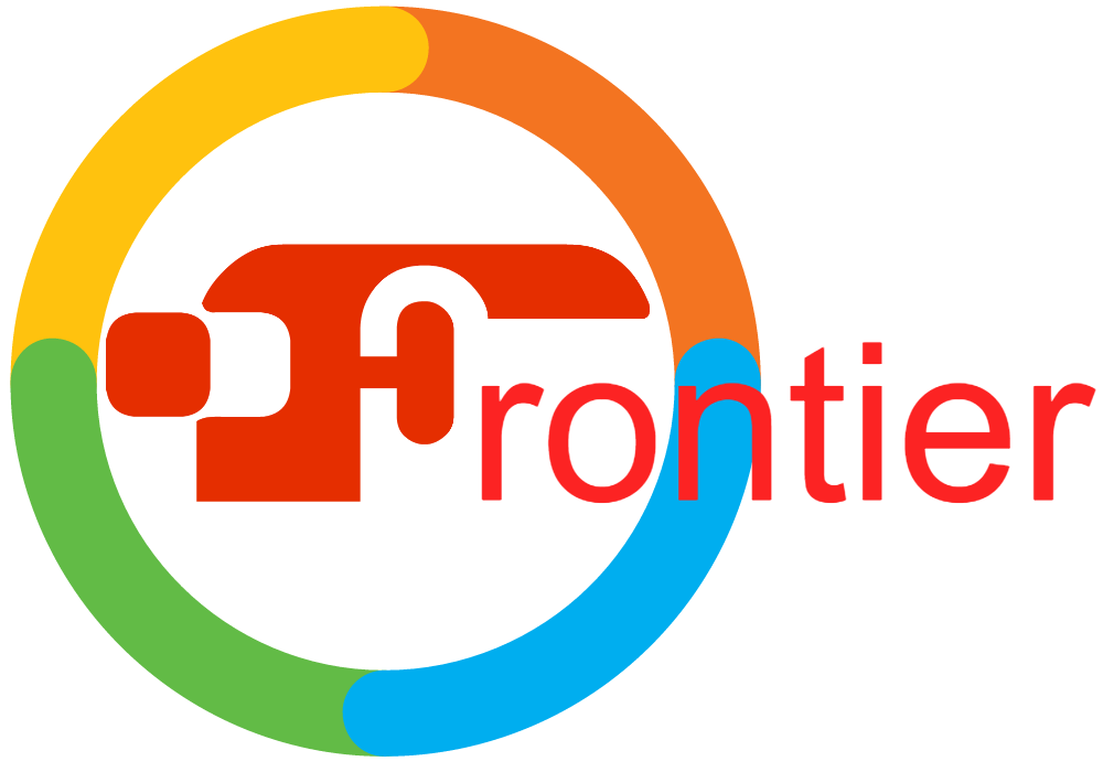
The old logo
The old logo is not necessarily bad in design, but a few fixes were required. The parts that required attention were the font not being quite user-friendly in terms of readability, the colour palette and a slightly dated look. I also worried about the scalability of the logo due to the thin and compact typesetting.
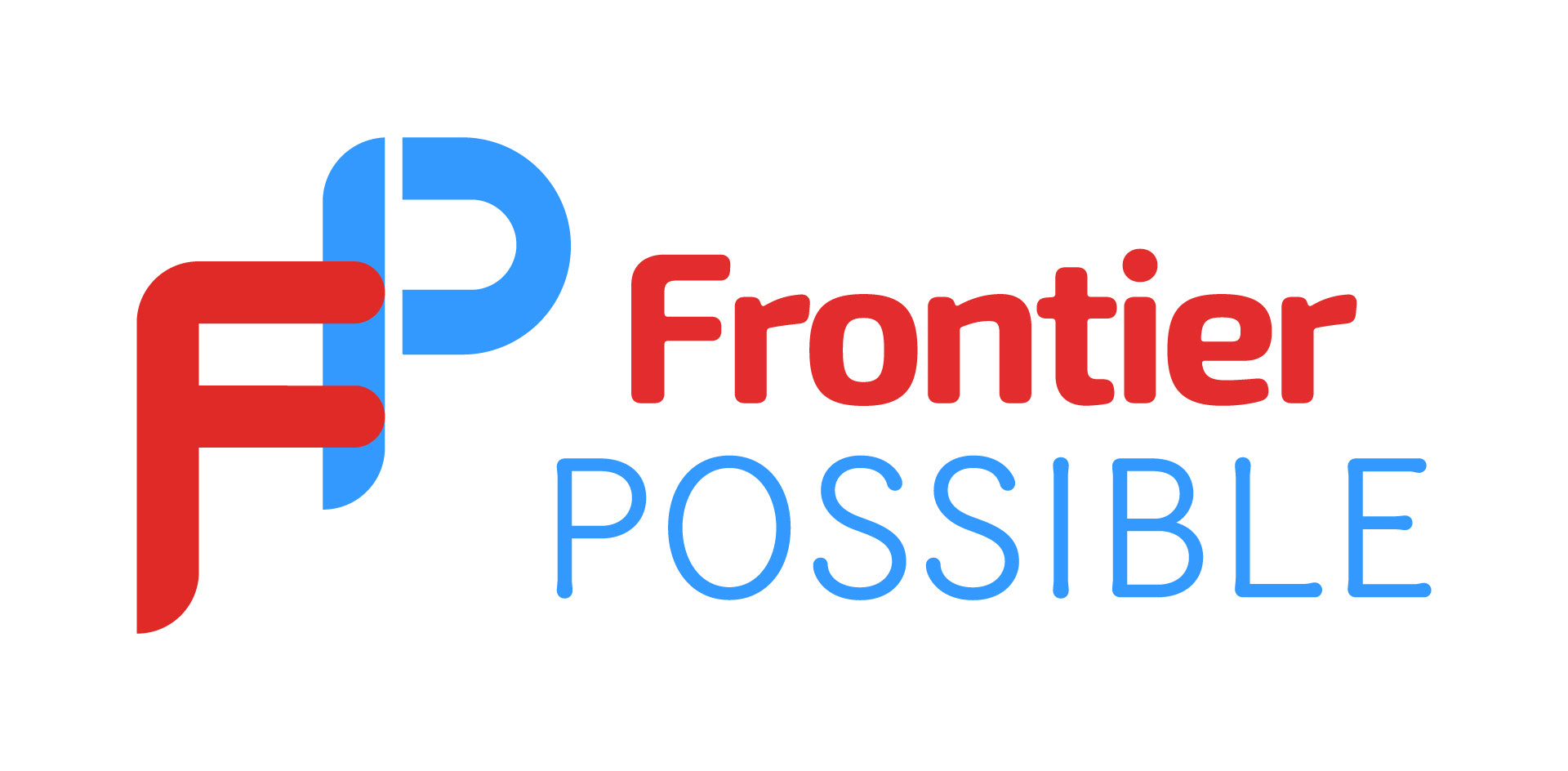
The updated logo
With a modernised look, the updated logo design is exactly what the owner ordered. We decided on a similar shade of red to the prior version to keep that tradition going. However, we introduced a lighter and more vibrant blue to the palette. This was to instil a sense of trust, reliability and integrity. The selection of fonts was important in conveying the brand's updated message. For the word 'Frontier', we agreed on a similar font (as this is the word that carried over from the previous business name), but more modernised through the rounded edges. The word 'Possible' changes it up with a very open typeface to express the idea that 'anything is possible' or the infinite possibilities. The rounded edges of both typefaces help make the business look less corporate and more inviting and friendly. The logomark is fairly simple and matches the wordmark nicely, conveying the same tones.
Need a logo update like this?
You can!