The Brief
The owners of Bounce Advisory had a clear mission when they came to me. With the last few years being a huge struggle for businesses of all sizes, the owners of Bounce Advisory wanted to help navigate these businesses through these tough times. Give them a BOUNCE you could say... Sorry, that was terrible! Rapidly moving on... To help businesses, the owners offer financial advice and strategies to help them succeed. They needed to seem approachable, especially for small to medium-sized businesses, as large companies would be fine and the owners recognised that. It was important to remain professional and credible, so blending both tones was my main challenge. The project overall was a logo and business card design, along with an animated logo.
The Outcome
Logo Design
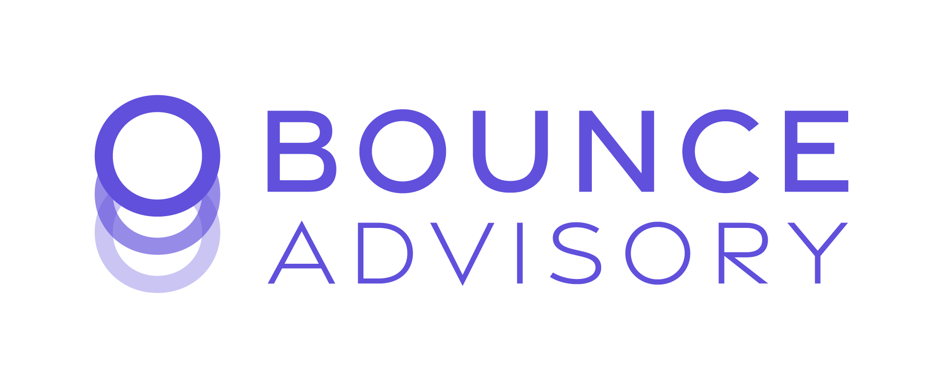
To reach the target audience outlined in the brief, it was crucial to create a logo that remains professional but doesn't look too corporate and intimidating. Using an open, rounded font rather than sharp, angular letters helps us achieve this. This is due to sharp shapes usually seeming more intimidating, while the optics of large, rounded shapes seem more welcoming and personable. As for the logomark, we continue using rounded shapes to create a ball-bouncing effect. It was important to create the illusion of the ball bouncing up to mirror the impact of partnering with Bounce Advisory, where their clients are in the ascendancy too.

Business card design & logo animation
For the business card, it was vital to continue to evoke the friendly and approachable tones set out in the logo. The simple way to do this was to use a rounded-edge business card, keeping the brand design consistent from the logo design to the card itself. Including an animated logo elevates the brand further, as the animation projects the needed tones better than ever before. The animation depicts the ball bounce, discussed in the logo description, and the reveal of the business name has a soft, friendly feel, emphasising the required tones mentioned in the brief and logo description. Overall, having a logo animation shows that the business owners are professional and that the owners care about how they appear to potential clients. Another tone that we wanted to convey. It's important to discuss the colour palette the owners and I decided on. We settled on a Majorelle Blue and an Orange-White because these colours evoke tones such as trust, integrity and reliability. Also, a sense of sophistication. All favourable tones that help the brand overall, especially when the business has to do with finances and the owners want to target small to mid-sized businesses, who may be hesitant to spend money on such a service.
Want a brand similar to this?
You can!