The Brief
When the owners of Kick Back Dentistry approached me, I knew I was in for an exciting project. They looked to help ease a fear that lots of people have. Going to the dentist! As the name suggests, the vision for the business was to provide a relaxing and calming dentistry service through an array of methods. To project such feelings, great branding is key. We determined an inviting and friendly brand would be the way to go, with a colour palette to match. Overall, the project featured a logo, business cards, a brand pattern and an animated logo.
The Outcome

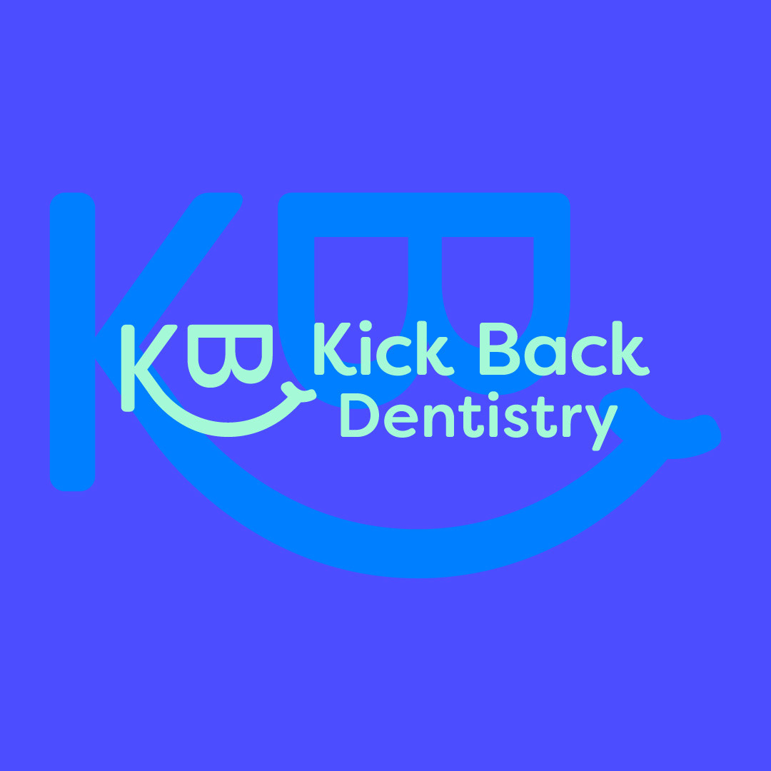
LOGO DESIGN
For the logo, a few key choices were made. The logo uses a font with smooth, rounded edges so the logo doesn't look corporate and is more friendly. We created the logomark using the letters K and B in the same font, with the concept of a smiley face. This links to happy and healthy dental hygiene and also a friendly service.

Business card & Brand Pattern Design
The client wanted to add a brand pattern to everything Kick Back Dentistry. What this does is increase the brand's memorability and its recognisability. It also adds to the aesthetic. It's important that any brand asset helps support the business's goals, including the brand pattern. For Kick Back Dentistry, that would be creating an inviting and friendly brand to draw customers in, helping alleviate the fear of going to the dentist. To do that, I scaled up the logomark and used the smiley face part. The owners can also use the brand pattern for carousel posts on Instagram, using half the pattern for one slide and the other half for another and so on. It's worth noting that the business card uses a rounded edge to continue projecting an inviting feeling and to continue with the smile shape for brand consistency. The colour palette is also an important aspect of consistent branding. The owners and I determined that a mixture of blues and an aquamarine green would help support the branding. The blues suggest a sense of trust and integrity, whilst good dental hygiene is linked with the minty-fresh tones of the green.
Logo Animation
The purpose of the logo animation is to help emphasise the friendly nature of the business, while also bringing some movement and life to the logo. It's another brand asset that can be added to the website and add appeal and memorability to the brand. The smooth reveal of the brand pattern and the logo links to the smooth and easy service provided by Kick Back Dentistry. Overall, the animated logo helps potential customers understand what their brand is about a lot easier compared to a static logo.
Want your brand to look like this?
You can!