The brief
The owners of the cleaning and NDIS support service business, Assegai, approached me thinking that their logo needed a slight redesign. Whilst their previous logo wasn't bad per se, it didn't quite project the tone a business of this type should. It was more war-like, with the idea of the shield protecting their clients and the spears being the weapons against things like dust. This logo would work for a product that helped with this sort of problem, but not as well with this type of service. So, the goal for the owners and I was to create a new logo that seemed more friendly and supportive, whilst representing the cleaning aspect too.
The Outcome
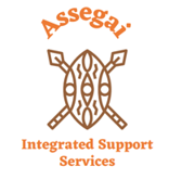
The old logo
Using Canva, the owners designed their logo with the idea of linking the business to their African heritage. Whilst the logo isn't necessarily bad, it didn't quite fulfil a few of the critical functions of a logo. These are the logo's scalability and the overall tone of the logo. Both are crucial in a great logo! This design's tone is somewhat war-like (like a coat of arms) and doesn't suggest a sense of support and cleanliness, the primary services of the business. The colour choice itself doesn't project cleanliness, as brown is not a colour that usually represents being clean. This concept is a perfect example of when a design follows the path of one direction but sacrifices other aspects as a result.

The redesigned logo
The logo redesign looks to remain linked to the owner's African heritage but evokes a sense of care and cleanliness. I've done this by doing some initial research about the word assegai, a weapon and a tree in Southern Africa. Sparking my idea for a tree-shaped logomark that looked like the letter A. The A is separated into two parts, one part looking as if it is hugging the other to project a sense of support. There's the support and heritage piece in the logo. Now, the cleaning aspect. Naturally, a clean colour, the deep blue, helps push the cleaning aspect, but also a perception of trust. Highly important in this business sector! We agreed on keeping a hint of Burnt Orange, as this was something the owners were keen on. The rounded, clean typeface I used brings the whole design together, as it pushes home the friendly support service and cleaning piece of the business.
Need a logo redesign like this?
You can!